Have you ever wondered what historical monochrome imagery would look like in colour within modern times? If so, look no further than Dappled History’s collection as they’ve made it their mission to highlight the value of giving a new contemporary perspective to archival imagery through colourisation.
To ensure historical accuracy, authenticity and that the images are safe to use legally, they invest a lot of time and effort into this process.
Carry on reading to discover how they started out as a picture researcher, how identifying a gap in the market lead to the creation of Dappled History, plus a step-by-step guide on their image colourisation process.
CG: Can you tell us how Dappled History came about and what inspired you to start this project?
DH: I previously worked as a picture researcher for one of the world’s largest illustrated publishers. This role taught me a great deal about the significance of images in education, as well as image licensing, rights, and copyright laws. For a long time, I considered colourising images but never took any action on it until 2022. That year, I made the decision to leave my job and travel for a year before deciding on my next steps.
Before resigning, I had planned to spend about six months at home as I had rarely been there in the previous 15 years. I intended to use this time to learn image colourisation, primarily to work on old family photos. However, due to unforeseen family obligations, I had to postpone my travel plans. As a result, that six-month plan turned into around two and a half years.
During this time I began expanding my library, and I realised there was a business opportunity in colourising historic images which I could then license. This is exactly the path I decided to pursue. I must admit though, that over time, I’ve come to enjoy my work more and more. Although my travels were delayed, if that hadn’t happened, I wouldn’t have acquired this skill. In a way, I now have a clearer idea of what I will be doing after my trip — at least for a while.
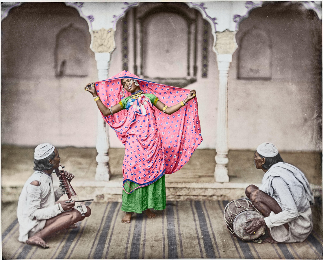
Nautch - girl. 1862. A native woman poses with her sari, spreading it open on her head, possibly part of a dance performance.
CG: How do you choose which images to work on?
DH: So far, I’ve approached it in the following way: focusing on famous portraits of authors, artists, scientists, adventurers, explorers, entrepreneurs, politicians, and so on. From my previous job I learned that articles and books often use photographs of prominent personalities to help tell their stories, and I realised that I could potentially generate a decent amount of sales this way. Which also serves to motivate me further.
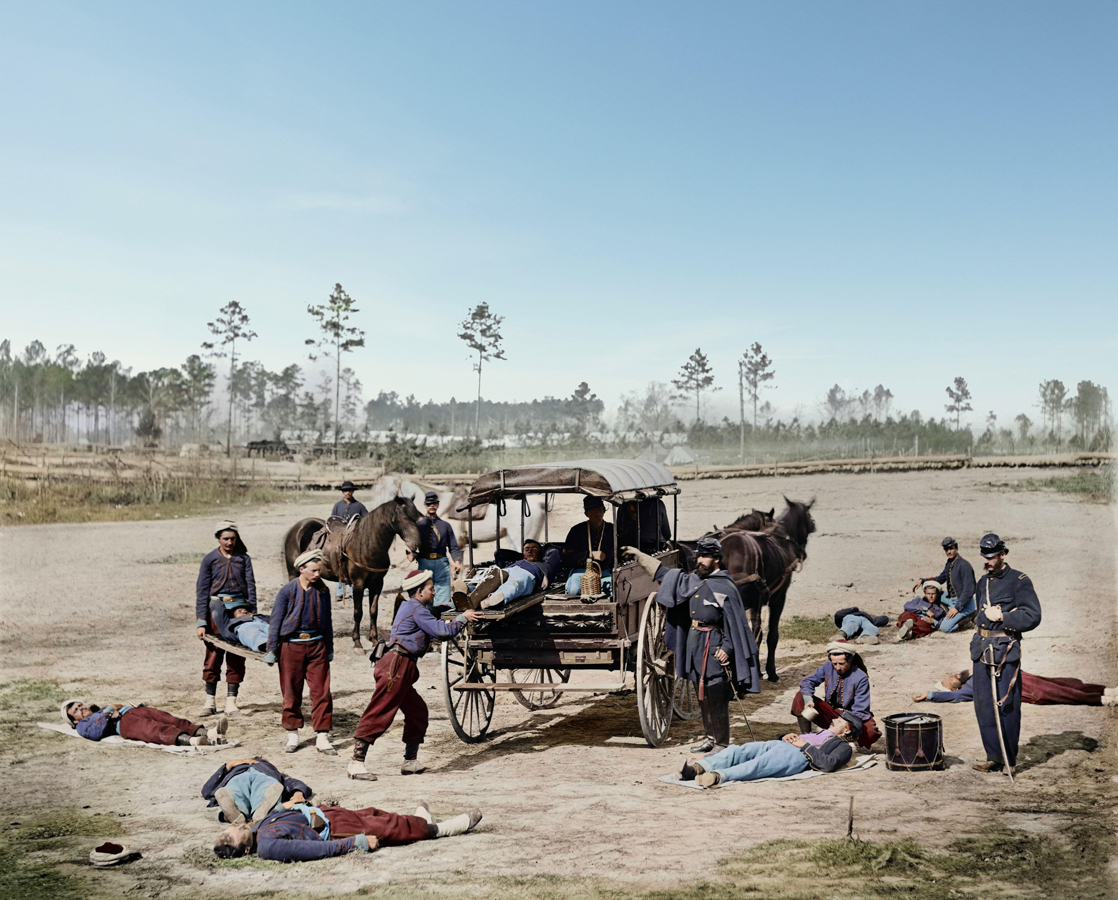
At the moment I’m concentrating on the American Civil War, primarily because it’s a subject I’m passionate about. I once worked on a book about it, and since then I’ve become deeply fascinated by the topic. In general, I choose images that resonate with me and that I believe I can licence. After all I put a great deal of effort into my work, and for it to be sustainable I need to make sales. This is where Alamy has been an enormous help, and I’m truly grateful for their platform and support.
CG: Can you tell us how the process works with image colourisation?
DH: The process I follow for most images is fairly similar, and can generally be broken down into the following stages:
1. Identifying the Best Version – As the images I work with are in the public domain, and there are often several versions or sources of the same image, it’s essential to identify the best possible version. This can sometimes be a time-consuming process. I compare images to assess resolution, noise quality, paper texture from the scanning, damage, missing elements, and so on. It can be frustrating to spend hours working on an image, only to later discover a better variation. I speak from experience when I say that I’ve learned the importance of being thorough in my research.
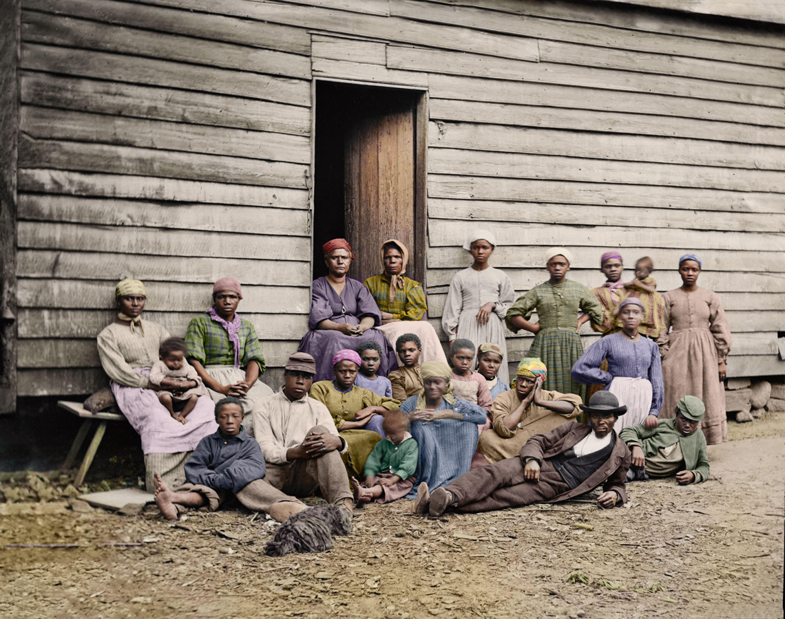
2. Researching Details – This is the part I enjoy most. It allows me to learn about the history of a place, period clothing, architecture, colour palettes, furniture, and more. In the case of portraits, I study the person’s features – the colour of their hair, eyes, and any other prominent traits. If textual descriptions aren’t available, I refer to period depictions like painted portraits or sketches to understand their likeness. Sometimes, I even learn about their possessions, such as watches, spectacles, or clothing. For military portraits, I focus on medals, badges, insignias, and flags. It’s incredibly rewarding when I manage to find the information I need, but it’s equally frustrating when I can’t. In such instances, I make a note in the image description explaining that the relevant information couldn’t be found, and that I’ve used my best judgement to recreate it.
3. Clean Up – After selecting the image I begin cleaning up any blemishes or damage. I generally avoid recreating elements unless they’re quite basic or superficial. On occasion I merge stereotypes to create a larger image, which adds a unique touch to some of my works. When it comes to portraits I understand there are various software and methods to enhance images, particularly portraits, to make them appear sharper and cleaner. However, I find that these methods often dramatically alter the portrait. While the changes might not be obvious when the image is zoomed out, they become glaring when viewed at 100% resolution. To me, this feels like tampering with history. I use these methods sparingly, only to enhance faint details or upscale the image without any loss, and I ensure no changes are made to the facial features.
4. Colourising – I use Photoshop to colourise the images. Elements such as skin, clothing, props, and backgrounds are painted in separate layers, which are further subdivided so I can easily adjust colours when needed. I pay particular attention to avoiding colour bleed, as I dislike it, and am careful to ensure the colours remain accurate. I’ve created colour palettes for skin tones, iris, and hair, which come in handy when painting details. Shadows can be tricky, and I still struggle with them at times. Overexposed images are especially challenging to colourise. Although most of my work is done manually, I use AI to speed up the background colourisation — let’s face it, hand-painting every blade of grass can be tedious, and AI often does a better job in this area. Nevertheless, I always review the results and make adjustments to ensure realism.
5. Enhancements – This could involve expanding the crop of the image to improve the framing. I might use AI or manual work to extend the studio wall or floor. Another common adjustment is replacing the sky, which I generally don’t like doing. However, it’s important to remember that in the past, exposure times were often long, which resulted in skies being overexposed with little detail. If the photographer had had the option, I imagine they would have tried to preserve the sky. When I replace the sky or make any other significant alterations, I always note the changes and leave it up to the viewer to decide which version they prefer.
6. Adjustments – Once the colours are finalised, I make overall adjustments to the image, such as colour balance, curves, exposure, and tint, to achieve the final result. In the past, I used to give the images a moodier tone, but now I strive to be more factually accurate. This has become my primary goal.
7. Adding Metadata – I used to dislike adding metadata, but I now find it quite enjoyable. The key is to be proactive and do it immediately, rather than saving up 50 images and doing them all at once — as I used to. This approach allows me to be more attentive and gives me the bandwidth to research the images more thoroughly, so I can add as much detail as possible to the image description. It’s actually very satisfying.
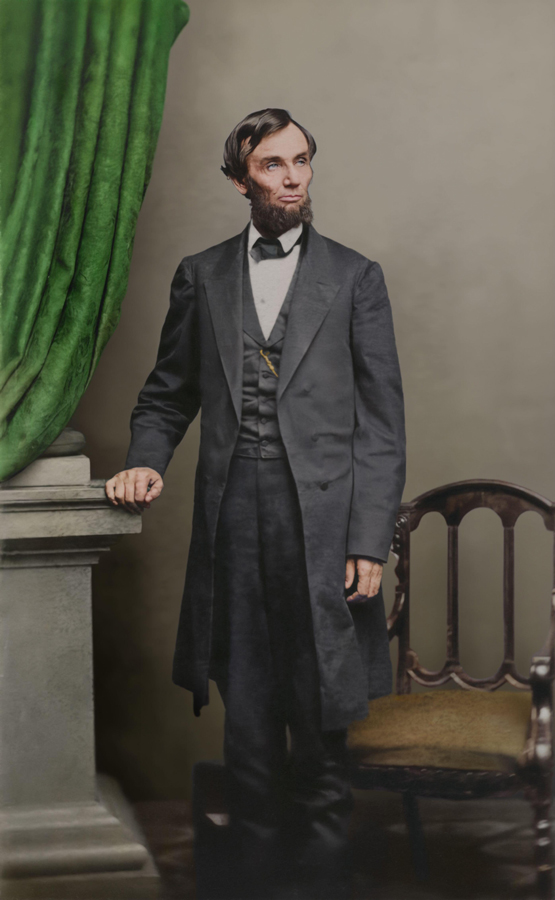
A near full-length albumen print carte-de-visite of Lincoln taken by Thomas Le Mere at Brady’s Washington, D.C. gallery on April 17, 1863.
CG: What has been your favourite image to colourise and why?
DH: I have two favourite images and the reason I love them both is quite simple. Firstly, they’re both absolutely fantastic — dramatic, with exceptional clarity, and beautifully framed. They also offered me wonderful opportunities for in-depth research.
When it comes to colour, the first image gave me the freedom to be creative and choose colours as I saw fit (while staying true to the period), while the second required me to be precise and accurate, which was a fascinating challenge. I also happen to love the uniform of the Zouave units in the American Civil war. I truly enjoyed colourising both of them, each in its own unique way.
CG: As your collection includes historical images, are there any legal complications you need to think about?
DH: Indeed, there are several important factors to consider, such as copyright laws, the license under which the images have been released, and whether any third-party property rights are involved. I typically focus on images from the 19th century which are usually exempt from these concerns, but I still take the time to examine each image carefully. Only when I am certain that I can license it, do I select it for further work. I make a point of using reputable sources and avoid picking images at random.
We hope you enjoyed the feature with Dappled History and learnt something new. You can find the rest of their collection here and their website here.
If you would like to find more archival content on Alamy you can find it here. As usual check in next month to see who’s collection will be featured, you never know it could be you!